Search This Blog

Showing posts with label D1. Show all posts

Monday, 17 January 2011

Assignment (Unit 108) - Final Images

My manipulation assignment didn't turn out exactly how I wanted them to.  One of them is pretty good, two of them are OK and one of them isn't great but with timing issues I don't think I'll be able to go out and do any re-shoots.


This picture of the six soldiers looking out over the countryside is my favourite of my manipulation images.  It took a long time to put this image together.  It's actually six images cut and pasted together, then dodged and burned to create the right lighting effects.  Using the brightness and contrast tools, I adjusted the levels on each layer so they were pretty similar.  Then, using the dodge tool, I lightened the sides of the soldiers to make it look as though they are all standing with the sun to their right.  I also had to remove some of the telephone poles from the background using my old friend, the clone tool. 


My only problem with the above image is the fact that it's obvious that it's the same guy.  Well it is to me anyway.  I tried another version of this image but blurred the guy at the front.  I think I preferred this image though.  This was achieved in pretty much the same way as the previous picture.  The main difference was the fact that the levels were already pretty close as the two guys against the wall were taken at the same time under the same conditions.  With the soldier at the front of the frame I had to erase a wall which he was leaning against.  I just created a layer and used the erase tool for this job as the magnetic lasso tool was starting to annoy me.


Now then, while I find the above image to be acceptable, the below image has some quality issues.  Blown up on a large scale it loses quality.  Due to the way the image originally was I had to do a lot of messing about with brightness and contrast.  I added some noise as well to try to give it a worn look.  The smoke in the background was achieved by taking a photograph of some clouds and painstakingly cutting them up and making them look like an explosion.

It was a lot of effort but didn't come out as amazing as I had hoped. The above image is a much stronger image.  I did have to use the magnetic lasso tool an awful lot on the main soldier.  The three in the background were much easier to manipulate because they were all from the same series of photographs.  I think I maybe should have removed the tree behind the main soldiers head.  It's kind of like it's growing out of his helmet.


As part of the book I've been making on blurb, the images appear OK.  I just feel that as large prints the images would look a bit suspect despite the amount of time and effort I put into editing them.

Assignment (Unit 108) - Original Images

When it came to manipulating my images I decided to try to create a bigger picture with my war theme.  This meant a lot of cutting and pasting to create images containing more than one soldier wandering alone in the woods.  A lot of my photographs didn't turn out as planned but I found a lot of these could be salvaged and used for this part of my assignment.


These four above images were all cut up on photoshop and blended together using layers to give the feel of a group of soldiers walking across a field.  In fact, with all of my images I had to painstakingly cut out my soldiers.  I found the magnetic lasso tool to be the most useful tool in photoshop for this task.


With this above selection of six photographs, after cutting out the soldiers and pasting them on the image, I had to adjust the brightness and contrast on each individual layer so they all matched.  Then with the dodge and burn tools I had to try and make the images look as though they were all lit from the same side.


So as you can see, these images aren't very good on their own.   Lot of them are over exposed or the sharpness isn't there.  I found that once they were edited and arranged properly, the flaws in the individual pictures didn't matter so much and the pictures as a whole didn't look too bad.


So that's the images I used for the manipulation section of my assignment.  My final results vary but without doing re-shoots I think they will have to suffice for now. With only two weeks left of the course it's a bit late in the day to start messing about with things.

Assignment (Unit 101-105) - Final Images


I know that we were supposed to select a minimum of six images and ideally I would have liked to pick six to ten images for this part of the assignment but I found it quite hard to narrow down my selection.  I ended up asking a few people who's opinions I valued to select their favourites.  This managed to trim my selection quite a bit.  I'm quite happy with the final selection.


The above picture was always intended to be my opener.  I wanted to get a photograph of my soldier reading about the war before heading off into conflict.  It took me a while to get an image I was happy with as the lighting and composition proved slightly awkward.  Looking back, I feel I could have probably produced a better image by using the studio lighting for this shot.  Unfortunately, the studio is not in my house so I had to make do with whatever lighting I had available.


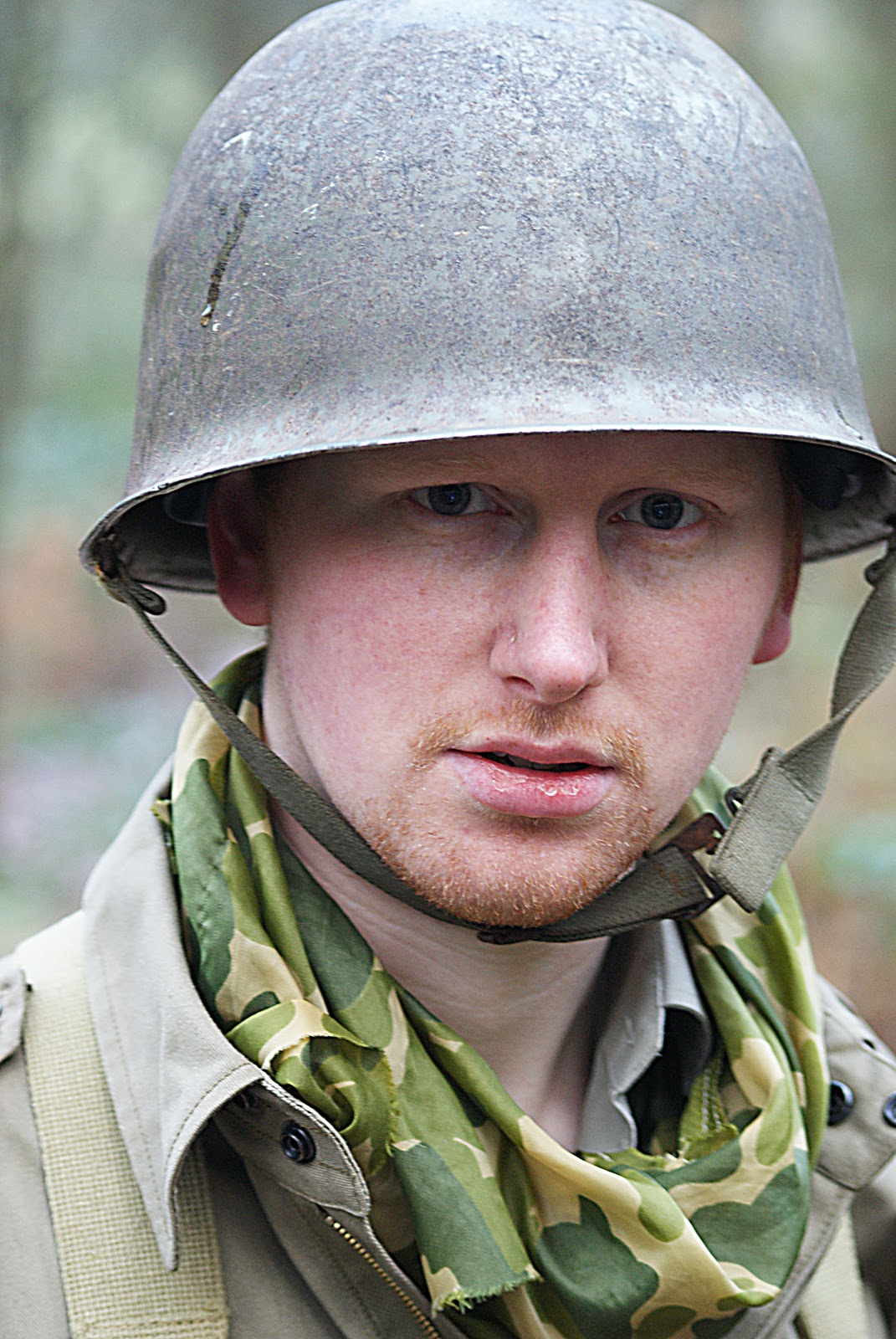
My only problem with the above picture is the fact that it's colour.  It doesn't look right in black and white as I feel it loses something in translation.  For my book though, I feel that this image will look good on the back cover which is why I have selected it.


The above and below pictures kind of give the feel that our soldier hasn't been in the battlefield for very long.  When I have arranged my images for my book I hope to convey a sense of the trauma the soldier is going through.


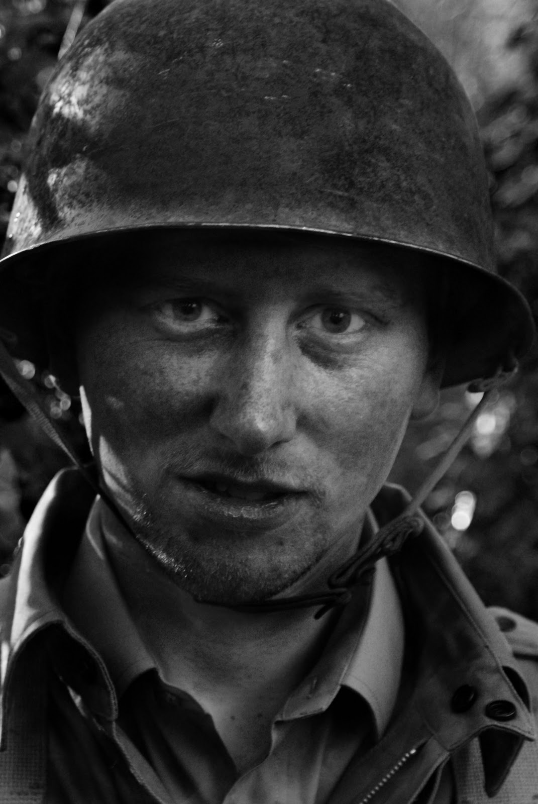
Using my favourite photoshop tools (the trusty dodge and burn) I think I managed to create a nice portrait.  I love the way the shadows fall on the soldiers face and I think that I managed to keep his eyes nice and sharp.


The 'panoramic' shot, I admit, was a cheat. Thanks to some nifty cropping I managed to create a nice picture which, in its original format, wasn't that great.  It goes to show that cropping can be an excellent tool if used properly.


Whilst on my shoot in the woods I came across some really nice little pieces of scenery.  The bricks and woodland give a bit more of a world war type feel to the picture.  It looks as though the soldiers are fighting in some kind of ruins.


I love the above portrait picture.  I feel the soft focus worked great in this instance.  Also, my soldier friend looks a little dazed but you kind of get the feeling that he hasn't fully experienced the horrors of war yet.


I had many variations of the soldier leaning on the wall.  This is my brothers favourite of those photo's so I decided to include it.  I managed to give this picture a very dated look.  It's even more dated than some of the other pictures.


In the above photograph, you can kind of see that the soldier has been through quite a lot since arriving in the battlefield.  The expression on his face and his weary eyes tell their own story.  He looks in quite a worse state than the previous portrait.  It's very Don McCullin.


I felt like I had to include some images of the bad guys otherwise it's just some guy running around in a field.  I managed to find a nice spot for this shot of the German taking aim.  This took a few attempts as the wind was starting to pick up. This became a factor due to the trees being blown about, creating all kinds of unwanted shadows from the sunlight.


I had this little picture story going on in which my soldier friend gets jumped by a German.  Now im not sure if I like the sequence but I kind of like this image.  I decided not to include the next few frames but below is the aftermath.  I feel the image makes you feel like the German soldier is having a moment of reflection or perhaps self doubt over the taking of someones life.


The above shot is one of my favourites.  I think I got the composition spot on and even managed to capture the breath of the German soldier in the cold environment.  It's like the German is off on the hunt for more prey. 

I tried this 'surrender' shot in different ways.  My first instinct was to go for a landscape shot but I think it works better as a portrait picture.  There's no large empty spaces either side of the soldiers so it's a fairly compact photo.


I have quite a few close up shots but I feel like they are all very different.  With the above shot I did have to use the clone tool on the helmet's strap.  In the original picture you can see that it's twisted.  I also used the burn tool just to bring out the shadows a little more.

I feel that most of these pictures have a nice flow about them.  They all look like they were taken under the same conditions and fit nicely together.  Like I said, when arranged into a certain order I feel that these pictures will tell a nice little story.

So there you have it.  My final images for Unit 101-105.


Assignment (Unit 101-105) - Original Images


These are my original images for my Unit 101-105 assignment.  With all of these images I converted them to black and white using photoshops 'black & white' tool.  I also ended up doing a lot of dodging and burning to achieve a look that I was happy with.  I do feel that the unedited images don't seem as powerful as the black and white versions.
f/5.6 1/20sec ISO-400


f/5.6 1/30sec ISO-400

f/4.5 1/8sec ISO-400


f/9 1/4sec ISO-400


f/5.6 1/40 ISO-800

f/5.6 1/40sec ISO-800


f/5.6 1/2sec ISO-100


f/8 1/5sec ISO-200


f/4.5 1/8sec ISO-400

f/5.6 1/40sec ISO-400


f/5.6 1/8sec ISO-100

f/4.5 1/10sec ISO-800


f/5.6 1/80sec ISO-400

f/5.6 1/30sec ISO-400

f/22 1/25sec ISO-400


f/6.3 1/6sec ISO-400


f/5.6 1/8sec ISO-100

f/6.3 1/8sec ISO-400
So that's the original photographs.  If these were the images that I had to submit I wouldn't be too happy.  Luckily, by being able to convert these photo's to black and white you can kind of get the feeling I actually know how to take a good photo.

I have never really been a fan of colour photography anyway.